Actually, I did look at it from a proportional perspective. I looked at the slice of the total wealth pie that each income group earns and the slice of the total tax pie that each income group pays. I did not look at size of the pies or anything else. Perhaps your objection is that you want me to look at a different pie? If so, show me and I'll gladly look at it.
For the more visual types, I went ahead and made charts, just because I'm kind of nerdy that way.

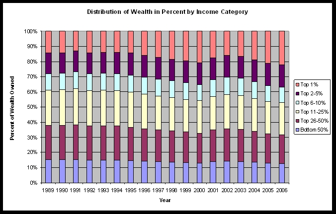
Note that the top 1% wage earners (orange) earn between about 15 and 20% of the nation's wealth. The bottom 50% of wage earners (blue) earn between about 10 to 15% of the nation's wealth.

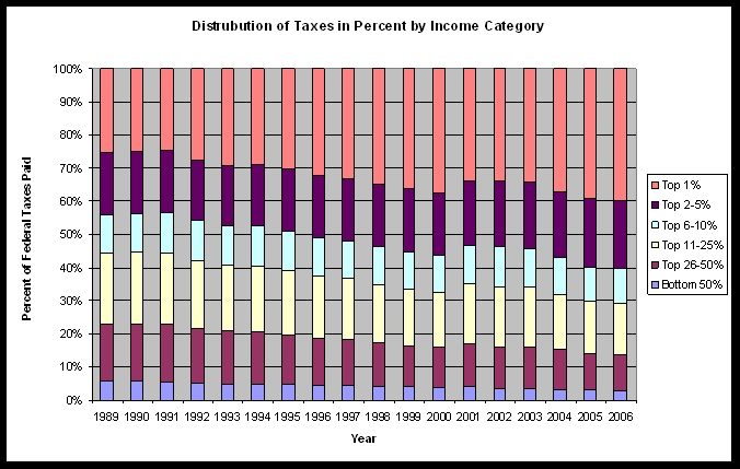
Here, the top 1% of wage earners (orange) pay anywhere from 25% to 40% of federal taxes. The bottom 50% of wage earners (blue) pay around 3 to 5%.
Basically, if the entire country earned $1000 every year and paid $100 in taxes (just using easy numbers), then in 2006, the top 1% of wage earners would collectively earn about $220 and pay about $40 in taxes, which means a tax rate of about 18.1%. The bottom 50% of wage earners would collectively earn about $125 and pay about $3 in taxes for a tax rate of about 2.4%. Interestingly, from these charts, the Bush years look similar to the Clinton years. At least here, I don't see any evidence that the rich are paying any less now than the poor in absolute or relative terms. Perhaps I'm missing something?
Admittedly, the data is not up-to-date. After a good amount of digging, I couldn't find the information for 2007 on the IRS website, but I doubt it would be much different. The 2008 information should be interesting given the financial disaster we're in, but of course we have to finish 2008 first to get data on that.


